NME Magazine
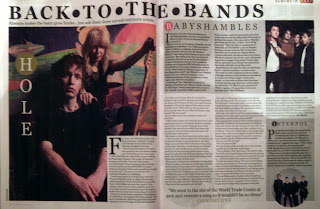
This double page spread can be found on page 32 and 33 of NME magazine and is part of the list of Albums of 2010. We know this because of the ‘Albums of 2010’ logo that is situated at the top right corner of the page. We have seen this logo a few times before and the font and circle motif has been used frequently on this page with the band names. The colour scheme for this particular page is black and white which contrasts greatly with the full page photo on the left side of the spread. The vivid oranges and greens stand out and are splashed across the page with the use of a green circle on the ‘H’ for HOLE and a red/deep orange circle for the ‘B’ in Babyshambles. It would seem that the photo was taken to tie in with the logo for the Albums of 2010 because this colour co-ordination seems to happen a lot throughout the following and preceding pages. These are the only colours used on the spread; the rest is in black and white and makes the headings and photos stand out without the need for borders or shadows. Before New Music Express became a magazine it used to be a non glossy newspaper and I think that a sense of nostalgia is gained here with the clever layout of text, headings and subheadings. The first noticeable point is the fact that this page is not slanted or brightly coloured or covered in different shaped boxes full of text. It has a very linear appearance which looks sophisticated and organised. This is a theme that I have noticed throughout this magazine. The way that the writing is arranged in columns which cover the page instantly makes me think of a newspaper, as does the big bold heading which is like a headline of a newspaper. The plain font and bold capital letters stand out and catch the reader’s eye and immediately tell them what this page is about as a headline of a newspaper would do. Below which is a subheading giving more detail about what can be found on the page. I don’t think that these consistent similarities with a newspaper are coincidental. I think that there was an intentional contrast between the new modern bands of 2010 and the evocative style in which this magazine and spread has been laid out. Darker grey boxes indicate separate pieces of text and helps break the page up to stop it looking like one giant mass of words. The layout of the page is easy to follow; the longest piece of text begins on the left page and covers a small section of the picture to show that this is what it the text is corresponding to. At the bottom of the right hand page is a quote from the interview written in larger bold letters and the name of the artist below in a different colour. This has been put here so readers will see it and think, “Oh this interests me I want to read it.” Three pictures have been used on this page, one for each interview. The main interview has the biggest picture which takes up the whole page and is probably the most detailed with props and a background etc. The other two are much smaller and only contain the band members standing next to each other. The Interpol photo is a different shape to the others which might suggest a different style of music; it is also the smallest which probably means this band is the least known out of the three. The sizes of the photo correspond to the popularity of the band and the size and/or detail of the interview. Sometimes it can be easy to distinguish what style of songs the artists have from the photo and the clothes they wear and how the picture looks however in today’s modern society where every different style merges into one and changes to often it is hard to tell. None of the photos seem airbrushed and photoshopped even though they probably are and the posture of all the artists is friendly and relaxed which implies that the interview is more personal and informal. The overall impression I get from this page is that it will be informative and insightful and will go into detail about the artists. It looks organised and sophisticated and would appeal to a market that is genuinely interested in the bands and doesn’t have to be impressed by stunning photos and writing effects etc.

Kerrang! Magazine
I chose to analyse this double page spread in Kerrang! magazine for a few reasons. Firstly this is the interview that was advertised on the front page with the main photo so I decided to see if there were any similarities between this page and the front page. Also, this page has a purple and black colour theme which is the colour scheme I would like to use in my magazine so I was interested to see how it worked inside a magazine and not just on a computer screen. This interview spreads over 5 pages and the pages I have chosen to analyse are in the middle because I thought this page had the most detail whereas the first page is a large picture with the interview title and the last page of the interview covers only one page and the other half of the spread is an advert. I apologize because I said 'page' 11 times in the last paragraph.
On page 24 and 25 of this issue of Kerrang! magazine there is an interview with HIM's front-man, Ville Valo. The two pages are mainly filled with a large photo in the middle and two columns of text on either side of the photo. The colour scheme of the page is very dark. There is a great contrast from the front cover of the magazine which uses bright pink and blue to this page which is predominantly black and white. White writing on a black background makes it stand out and the long columns of writing are occasionally broken up by the starts of new paragraphs where the first two words are written in BOLD, PURPLE CAPITALS. These words don't really tell the reader what the following paragraph will be about but signifies the start of 'a new chapter' of the interview, giving a storybook effect to this double page spread. Not a lot has really been put into this text like quirky text boxes or slanted pictures and writing to draw the reader in so it suggests that this interview will be read by HIM's hardcore fans rather than someone who is just flicking through the magazine in search of something interesting. However, like the interview in NME magazine, a quote from within the text has been written again somewhere on the page and made to stand out by changing the size and colour of the writing. This particular quote has been written in purple to tie in with the colour scheme and the background is HIM's heartagram logo. This quote is one way to draw readers in because they see the quote and want to know more about it like why it was said. There are two styles of photographs on this page. Firstly is the large photo in the middle which is the first thing that catches the readers attention. It is clear and looks like Ville Valo has posed for it, however his eyes don't look at the camera which gives the effect that he is thinking or he doesn't know the camera is there. The other style is the kind that are situated on the far right of the page. These are less clear and some are blurry which suggests they were taken in a hurry or the person in the photo was moving around frantically. This gives the photo and the interview in general a more personal feel as though they are his own private snapshots like on the contents page of NME. Also the arrangement of these photos is similar to that you might find on a photo booth where you go with friends and take photos as a souvenir. Both these styles of photos give the feeling that we are getting a sneak peek of what the life of Ville Valo is like. It almost feels like we are intruding. The photos are black and white, not only to tie in with the colour scheme but also it makes the photos seem old fashioned. This old fashioned, almost reminiscent feel is reinforced by the filigree metalwork on the headboard of the bed and floral patterns on the curtains both of which are similar to Ville's tattoo sleeve, and the fact that he is using paper to write on as opposed to a high-tech computer or laptop. I think they have used this style to show that Ville Valo is an independent person who moves at his own pace and won't follow the crowd and succumb to the temptation of modern society. At the end of the text a small arrow has been used to show the reader that the interview continues on the next page. The overall feel of this page is simplistic and old fashioned.


No comments:
Post a Comment