TitleI have come up with several different names for my magazine and these were:
This is music
Music Notes
Noise
Sing
I wanted something that was easy to remember and catchy it would stick in peoples heads. I think the four of these ideas
achieve this so I made them part of the questionnaire and let
the public vote. These are the results:
The questionnaire showed that the people who voted preferred This is Music as the title of the magazine. 12 people answered this question all together and 9 voted for this title.
Colour SchemesA colour scheme is very important in any product. It tells the buyer a lot about an item for example something that is bright and colourful might be directed at children where as something that is dark colours is perhaps more adult orientated. For my magazine I will stick to only two or three main colours to prevent the magazine looking too garish. The colour theme that is chosen from the results of my questionnaire will be used for my house style throughout the magazine.


These are the five colour schemes I suggested on my questionnaire. My favourite here is purple and black because these colours are not opposite enough to each other to clash or contrast badly, but stand out from each other and they make the product look sophisticated and professional more so than something with many different clashing colours. My least favourite of the five is green and orange. I like these colours but I think that putting the two together is too much. They are very bright and I think I would need to balance it out with a lot of dark text and photos which would clash I would like to avoid the magazine looking to garish.
The questionnaire showed that the people who voted preferred purple and black as the main colour scheme. 12 people answered this question all together and 9 voted for this colour scheme.
Typefaces
Like colours it is important that I don't use too many different ones. I have decided to stick to 3 different fonts. These will be for the page title, subheadings and text. The following are the ones I will consider using.
Page Title


My favourite of these three fonts is the first one VTKS Revolt, however I think that it is too detailed and will probably be difficult to read so I think I will use a less detailed font like The Birth of a Hero. I have chosen this one over Cafe Lounge 19 because it suits the style of my magazine more because it has the rough eroded style that I like which many magazines of the same genre use. To suit the colour scheme this will probably be written in white or purple with a white border. If this doesn't work I will put it on a backing that makes it stand out.
Subheadings
There is a theme throughout my magazine of crumpled up paper and I think the font that would suit this best would be the Rough Typewriter font because it looks authentic and will add to the character and emphasise the house style of my magazine.
Text
The font I will use for the main text of my magazine will have to be a very simple font for a few reasons. Firstly it will be made quite small so the maximum amount of writing can fit in the selected area so if there was a fancy detailed font it would be impossible to read at such a small size. Secondly, there will be a lot of writing and if the font has a lot of detail and unnecessary patterns it will look too garish and disgusting. So the following are the four ideas I have to choose from:
Courier
Times New Roman
Arial
Georgia
Whilst analysing the NME magazine I noticed the font they used and I liked it however the magazine keep this font secret so I think I will create a similar font to use in my magazine. The font in NME is similar to the Georgia font you see above. If all else fails I will probably use this or Arial.
Photo ideas and inspiration
 This is perhaps one of the most famous album covers ever and is very striking because of the contrast of dark and light. The way the light has been positioned has cast shadows in the eye sockets and cheekbones of the Queen band members, creating quite a haunting effect. However even though there is a lot of over exposure to the faces they are still recognisable. I like this idea and I would like to create this effect on the person in the background of my front cover so they stand out but are not as prominent as the main photo which will have more natural light and colours.

This is another album cover which I have taken inspiration from because they have also used the lighting to create shadows to emphasize the features in the bands faces. This style of the staggered faces is the same style I want to achieve in my cover but with more emphasis on the main person. An advert for this album was on the back page of the Kerrang! magazine I analysed and it caught my eye straight away because of the dark and light contrast.
Initial Designs
 This is my first initial design for my front page, the elements from this design which I will take to my final design are:
- Magazine title on a background
- Inside stories down side of page
- Bar code in lower left corner
- Pug

This is my second initial design for my front page, the elements from this design which I will take to my final design are:
- MCU of main artist with background person/people
- Main story and/or artist
- Crumpled paper effect corners
- Banner at top of page

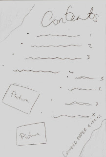
This is my first initial design for my contents page, the elements from this design which I will take to my final design are:
- Writing in straight rows not staggered like design 2. Makes numbers easier to rea
- Two sections of writing (regulars + this week)
This is my second initial design for my contents page, the elements from this design which I will take to my final design are:
- Page title at top of page
- Crumpled paper effect (inverted front cover)
- Slanted pictures with shadows
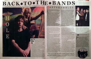
This is my first initial design for my double page spread, the elements from this design which I will take to my final design are:
- Crumpled paper effect at side of page
- Columned writing
- Album Cover
- Band name at top of page
This is my second initial design for my double page spread, the elements from this design which I will take to my final design are:
- Having the photos of everyone medium close up as opposed to full body shots.


 This is my first initial design for my front page, the elements from this design which I will take to my final design are:


 This is Stu Harrison, he is an 18 year old male and he represents the typical group of people that my magazine will be aimed towards. Stewart lives in Bournemouth in an apartment with his two friends, Steve and John and together they formed a band of which he is the guitarist, who perform covers of songs to small audiences in their area. The genre of songs they perform are the same as the genre that my magazine is based on which is indie (alternative) rock, a style performed by bands like Razorlight, Snow Patrol and The Fratellis. He plays a variety of instruments like drums and piano but mainly guitar which he has been learning since the age of 11 however like most unlabelled bands these gigs are not his main source of income. He has a job at Topshop and buys a lot of his clothes from here with his staff discount. The clothes he wears don't really stand out like those of other stereotypes. He usually wears faded blue or grey jeans with his favourite pair of white converse, which are now a dirty brown colour after years of abuse from the elements. He sometimes wears pullovers on top of t-shirts with big pictures or designs on the front but he dislikes cardigans how old they make him look. His favourite band at the moment is Keane and spends a lot of his free time walking along Bournemouth beach listening to their music. He likes to keep up to date with current music by reading magazines like NME and finding out what's new in the world of song and rather than having a TV on all the time in his flat, h


